|
Option Trading College Subject:
Basic charting |
.jpg) |
|
Option Trading College Subject:
Basic charting |
|
Session 1
|
PORTFOLIOS
Members Training Links
|
||
Session 2 – Support and
Resistance
There is a saying I like, "The teacher will appear when the student is ready....Are you ready?"
The
first thing you will need to do is start to look for patterns in the stocks you
choose to play. Each stock has a unique personality and style all its own. The
reason for this is people are people, and well, there is one person who controls
each stock traded on the NYSE (specialists) and a few large players who control
the NASDAQ (market makers). These people buy the stocks in large quantities and
then piecemeal them out to you and me. They are investors like us, but with
substantially larger money pots to dip into.
Each day when the MM starts up his computers, he sees a list of sell orders and buy orders (open order book). He takes a look at the stocks closing price and decides where he will open it for trading...thus the explanation for the gaps up or down. Once the initial opening price has been traded, the general trading public kicks in and drives a stock up and down throughout the day. Now here is the interesting part about this manipulation I was talking about. It happens at the end of the day. There is another system of order routing called Trade Imbalance or Market On Close orders. If there is not enough stock to cover, the MM has to adjust the price to get buyers or sellers motivated. If you take a look at the charts below you will see what I mean:
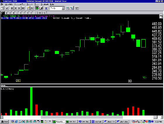
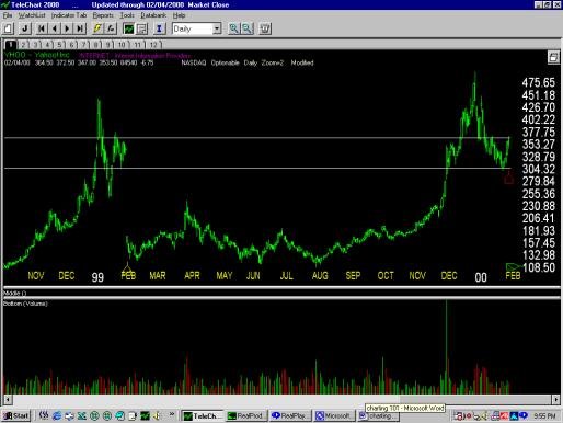
In
this first chart, we will take a look at why a stock tends to stop as specific
price points on any given day. Here is an old favorite of mine, Yahoo! Inc.
(YHOO). Notice how it stops at certain points along the way? (You have to always
be in a detective mode to see things.) The first question would be why did it stop
there?
figure 1
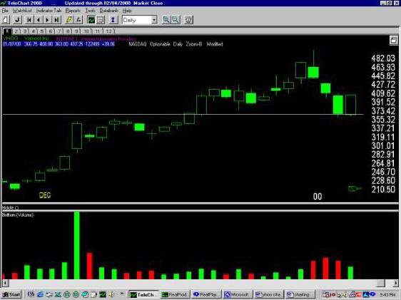
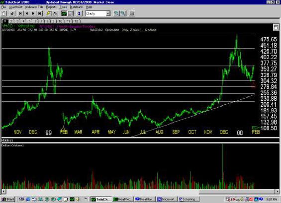
Now
take a look at the second chart below.
figure 2
I
have drawn a trend line at the point it stopped at. If you follow the line, you
will notice Yahoo has support from a few days back but is this enough to make a
buying or selling decision? I think not. Lets dig a little deeper shall we?
figure 3
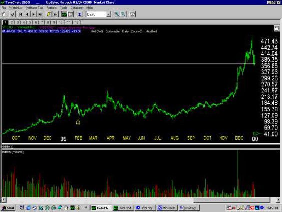
It
appears to have stopped for no reason right? Well here is where TC2000 really
makes the difference from those freebie charts. I will un-adjust the split back
in Feb ‘99 and lets see what we see.
figure 4
The
support line I drew is actually an old resistance line back in Dec of 1998. Yahoo gaped open
over that resistance; then it became support while it made a new high. Notice how
quickly it fell below this line and then became resistance again by the time the split
kicked in. A picture is worth thousands of dollars!!
|
|||
|
Session 2 –
Now
we will go forward to see where it is going to end up? Any guesses?
figure 5
After
making another attempt for the high, Yahoo failed and fell below support. The
line is currently becoming resistance again and we have a split coming next
week. Did you notice where it stopped falling?
figure 6
Right
where it stopped last time. Are you getting the picture here? Is this stuff
amazing or what? Now I will finish drawing the lines at key stopping points and
we can predict where this stock will climb or fall to in the future. In my
experience I have found this to be accurate better than 70% of the time. Even if
it spikes up or down from a key support or resistance it returns to it shortly.
Notice the top of the next chart and the bottom.
Figure 7
See
where it broke out to a new all time high of $500 but then quickly fell back to
old resistance at $450? Now look at the diagonal line, this is where Yahoo is
likely to fall after it clears the support from the last dip and notice that the
diagonal line intersects the fall before the last split run. Of course it’s
not a guarantee but you can sure plan on it being close. Therefore you need to
place your orders to buy and or sell accordingly. NEVER try to pick the top or
the bottom, just shoot for the fat middle. Also one last note, make sure you buy
enough time to ride the dips especially on these Internet stocks.
|
|||
|
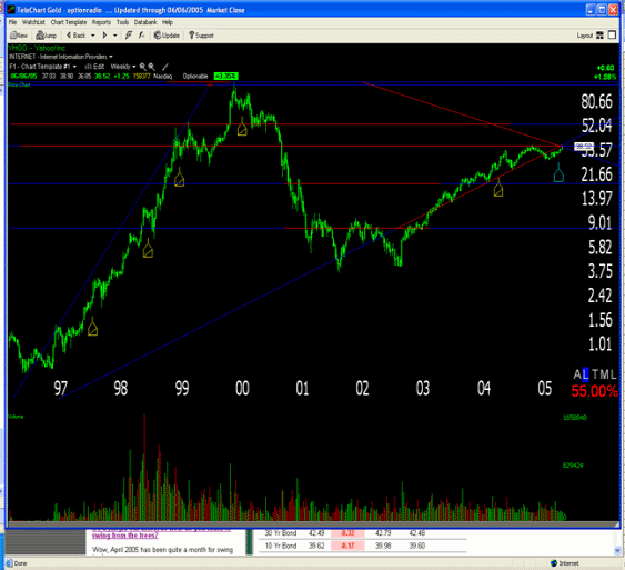
It's been over 4.5 years (wow does time fly) since I wrote this section and I am now going to post the chart on Yahoo to see how accurate my theories were. [are!]
figure 8
Now isn't this interesting? Notice that back at the end of 2000, I showed the support and resistance lines (figure 7). If you look into the future you will see that Yahoo came right down to my support line and then violated it with each subsequent stop at previous major support lines. Then at the end of 2001, the stock took on a nice rally and just like clockwork it failed at resistance from early 2001. Notice the lengthy recovery from mid 2002 all the way through the beginning of 2004. Why did it finally take out that resistance? They announced another stock split and it was happy days again. Once the stock split, it quickly rallied right back to old resistance from 1997!
Now the stock is sitting at a very pivotal resistance line. It goes all the way back to the first split on 9/2/1997! See how the long-term trend line from its first all time high intersects with the last split? We are at a major crossroad with this stock. Simply amazing stuff! You really need to subscribe to TC2000 to capture the full benefit of un-adjusting the splits. www.tc2000.com
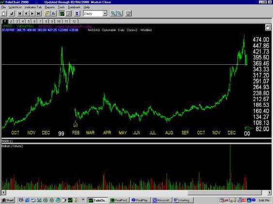
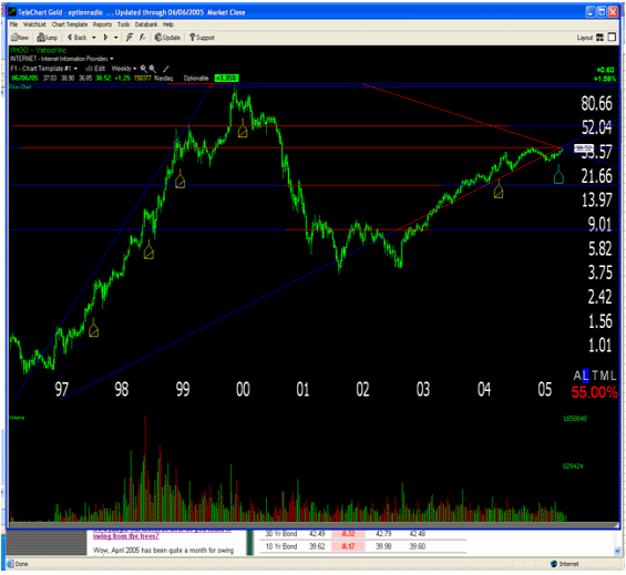
Here is what it looks like if you cannot un-adjust the stock split:
figure 9
It's pretty hard to predict with a lot of accuracy where the stock is going.
|
|||
| Session 4 – Deciphering Chart
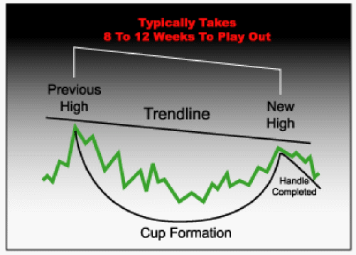
Patterns There are several types of chart patterns you can use to help you make good trading decisions. First up is my personal favorite...it's called the Cup & Handle. The Cup & Handle formation is very popular with technical traders. In fact, it's become so popular, it's very hard to get one to fully set up! What you want to look for is stocks that has had a strong move over the past 2 to 4 months. Once you spot that, you want to see it go through a slight correction; typically the stock will sell off into a slight correction for around 30% off its previous high point. If you find a good one, it will have taken 8 to 12 weeks to properly set up. Of course, the overall market conditions play a factor, so do not get married to the pattern.Now, once a stock moves up to test that old high, it should incur some selling pressure and this causes the stock to drift sideways for a few days to as much as 3 weeks.
Next, you want to pay attention to the handle. It should be 5% below the previous high point. If the handle should fall more than this, I would use caution. When should you buy? That depends on two things. The stocks volume coming out of the dip, and the overall market/sector conditions. The trigger point is when the stock rises into a new high at the top of the handle. Note: do not use the previous high as your top. You can find some of the biggest winners in stocks when you start to recognize this pattern...it's VERY powerful! In fact, it has been one of the most reliable of all the chart patterns; and when you find a classic formation, you can just about print money! There is one caveat that needs to be adhered to: The best time to take advantage is when the best stocks are moving with the market/sector at the beginning of that move or after a good market correction. Do not jump the gun during, or at the end of a major market advance—you want the momentum to carry you...not bury you!
|
|||
| This website is an excellent training resource on all things charting: https://stockcharts.com/school/doku.php?id=chart_school:chart_analysis:chart_patterns
rofits Up!
The donFranko
Calls | PUTS | CHARTING | COVERED CALLS | l.e.a.p.s | spreads | NAKED PUTS | PAIR TRADING | Training Home
|
|||